Working With Red. Ugh!
How is that for a title? Hahahahaha! I do not like red. I grew a great distaste for red when I was in training to be a Copic Instructor. We had to color a Santa and those different shades of red and trying to blend just about did me in. So I was not all that hyped when Tracy told us we were working with red on day three.
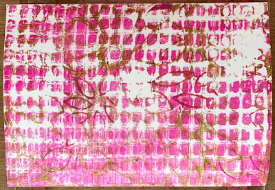
Day three of what? That would be the 5-Day Postcard Challenge class taught by Tracy Weinzapfel. An artist I have followed for several years now. For the class I decided to work on the Nostalgie Postcards from Hahnemühle. A smooth 90 lb. card that can handle some wet and is easy to draw on. Prior to the class I had a day of monoprinting and chose some of those prints for the postcard challenge. This particular print was made on a gel printing plate from Gelli Arts. I was hopeful that all the lines and squares would make some nice texture for all this red. Hahahaha!Then this happened. I decided to add tangles into those arms. Onamato, shattuck, curlz, coral, all boxed up, surfs up, printemps. Now this is more up my comfortable alley. Hahahaha! Evelyn, it's in there. Look for it.
And our last steps. Can you tell a difference? And finally - I added the white accents. I like the contrast between the red, the black and the white. I like that I can still see the flower petals in the background. And the squares inside the circle. Layers of texture and art.
And the big reveal. That pink helps me accept the red better. Actually I love the red in this piece. And I didn't have to blend it like a Copic. That makes it even better. Hahahahaha! I did have one little bobble removing the tape in that lower right corner. Tracy taught us to use a heat gun to remove the tape. Heating it up seems to make it easier to remove. I guess I was a little impatient. Oh well. Lesson learned.
Hahnemühle's Nostalgie Postcards


This is so beautiful, Alice! You took the project and ran away with it!
ReplyDeletethanks, sandra, it was a surprise to me that it turned out well and it was red. hahahaha!
DeleteYes - found it nestling in it's favourite place (yes, you made me really grin). I agree, it's the contrast with all the white. black & red that makes this eye-catching. However, it's the texture & all the background detail that adds the interest. Isn't it fascinating how things work together.
ReplyDeleteThey really do all come together perfectly
Delete