Hahnemühle Mixed Media Mini Journal
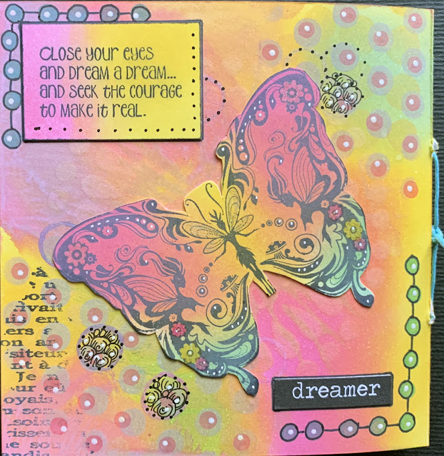
Apart from that, this last week I did an online class with Marjie Kemper and we made this little book. Completed it is 5" x 5". I used Hahnemühle's Bristol Illustration paper to make mine. Two sheets of the roughly 8 1/2" x 12" pad for this entire book with all its elements. And since it was a paying class I will not be giving you a step-by-step. Just showing you pretty pictures. And I am already working on another. This is my cover.
I learned a few things as we worked on our books.
* I should color my word blocks first. Then add the stamped image. The black will stand out more that way.
* Many of the picture images could be done the same way. Add the color to the block first. Then stamp the image. If more color is needed it could be applied at that time.
* Do not stamp images directly into book. Stamp them on one of the scraps with color added, then adhere into book where it should go. At least one of my images is kind of lost in a dark background. Without a flashlight. Scary.
* Ink the edges of each page before stitching the book together. These didn't get inked at all.
For color we used Ranger's Distress Ink pads. I also used a couple of the oxide ink pads. I brought in my Zig Clean Color Dot Pens, Spica Gel Pens, Posca Paint Pens, a bunch of stencils cause I have a bajillion of those, ink blending tools and probably other things. It was a lot of fun and Marjie's teaching style is so calm and relaxing. Just what I needed this past week. A lesson that took her one hour took me an entire day to complete as I sat here and stared out the window a lot. Last week was not good but this week is starting out better.
If you are not subscribed to my blog and would like to be - there is a subscribe block in the left sidebar. Scroll up and you will find it. Thanks for being here!
Hahnemühle's Bristol Illustration paper can be purchased here.


This is beautiful, Alice! I really like the way each color is allowed it's space. I'm glad this week is starting out better too. You know you have my prayers and will continue to do.
ReplyDeleteI really had fun doing this. I have already started another with an underwater theme. pages are colored and stitched together
DeleteThis is gorgeous, Alice!!! A friend and I both did this workshop and love Marjie's teaching style. My friend's book looks fabulous...I'm still plodding along waiting for a theme to pop into my head.
ReplyDeleteMary
I wish I had waited to come up with a theme but I didn’t really know what we were doing so I just jumped right in. Now I’m working On one with a theme.
DeleteThis is beautiful Alice. As far as a theme, I would hopeful/positive thinking demonstrated by the colors you used. As always, thanks for sharing.
ReplyDeleteThanks, Nancy, I do love this book.
DeleteWhat a color party!! Gorgeous and exciting, Alice! Now I wish I had taken Marjie's class. Thanks for sharing with us. :) I'm always happy to see what you've done!
ReplyDeleteAnd whatever it is that's causing you worry ... allow us all to hold you up to the sunshine for an easy and thorough resolution! <3
Thanks, Jan, looking at possible lung cancer. Prayers are appreciated.
DeleteWow looks like a theme to me, its just stunning in color and content. I really like the blending of one color into its neighbor, reminds me of color blocking using scrapbooking papers, You could also use punches and stickers. I think yours looks well planned out and very professional. Its just charming.
ReplyDeleteThanks, Maxine, I do love the colors!
DeleteYour new cards are perfect dear Alice. I love them so much 👍😍🤗❤️👋
ReplyDeletethank you, regina, it was fun to just play with color and see what happens
DeleteBeautiful Alice! ❤️🙏🙏
ReplyDeleteThank you ❤️
DeleteOh I must have missed this so glad to have caught up with it now. Interesting mix of elements & especially to see how the multicoloured elements all with the same combination of colours work. I'd never have imagined that would be so effective.
ReplyDeleteI love this little book. it makes me happy :) and I am almost done with a second
DeleteCame back to this - I do like how you've included swatches of the colours you used for the entire book, as I remarked before (somewhat obtusely) it's fascinating the way that the same colours of the background is used for the elements also. Though - as you remark - it only really works if your image has been created on a scrap piece of the inked paper for only then are the contours of the image discernible instead of sinking into the oblivion of the background. Lovely seeing your signature dots including those very individual dot borders.
ReplyDeleteI guess those dots are going to follow my printemps in the art trail. hahahaha! at least until my pens run out of ink.
Delete