Hahnemühle has a new watercolor book available and you are going to need to get one for yourself! Or maybe two! I love mine and have had a fun time trying out various art methods in it. Not just watercolor. Let me show you.
The 95 lb. pages are roughly 5.5" square and come in either beige or grey shades. The book I have is beige. I did not know how the color of the page would affect my art, so I just got right to work. I could figure it out along the way. The pages lay flat when the hard cover book is open. There are sixty pages total, that comes out to 120 work surfaces. The page surface is smooth with very little texture.
I began with some painter's tape along the edges on one page. After wetting down the entire page I added
Schmincke watercolors in bands of color, then let them sit to dry.
After spritzing some water on the dry page, I brought in some extra lines of color with my Schminckes.
Remember I said I didn't know how the beige paper would affect my watercolors? Once this page was totally dry you can see the colors faded into the paper. They were not as crisp and bright as I wanted. So what to do?
I spritzed on more water and added more layers of color. By this point I had added quite bit of water to the paper and the paper was holding up just fine! No pilling, no warping.
And this is what my page looked like once it was dry. I lost a little color in vertical bands where I had too much water, but overall the colors kept their brightness. Very satisfied at this point but I wasn't done.
I used a
Sharpie ultra fine pen to draw the flower, then painted it with more Schmincke watercolors. Finishing details were made with
Posca paint pens.
This neat trick I learned from Tracy Weinzapfel, an artist friend of mine. I used the
Archival ink pad and a
stipple brush to add a border to the outside edges of the painting, except over the flower petals. This little trick gives you a nice crisp border when you remove the painter's tape.
See what I mean? I also added some stamped texture in the background, then finished this off with a stamped sentiment and some Posca paint pen highlights.
So, how did I like the beige paper? It made my colors a little darker and flat but that was easily remedied by adding an another layer of color. The paper handled the amount of water I used like a champ! In fact, it made me want to try something else.
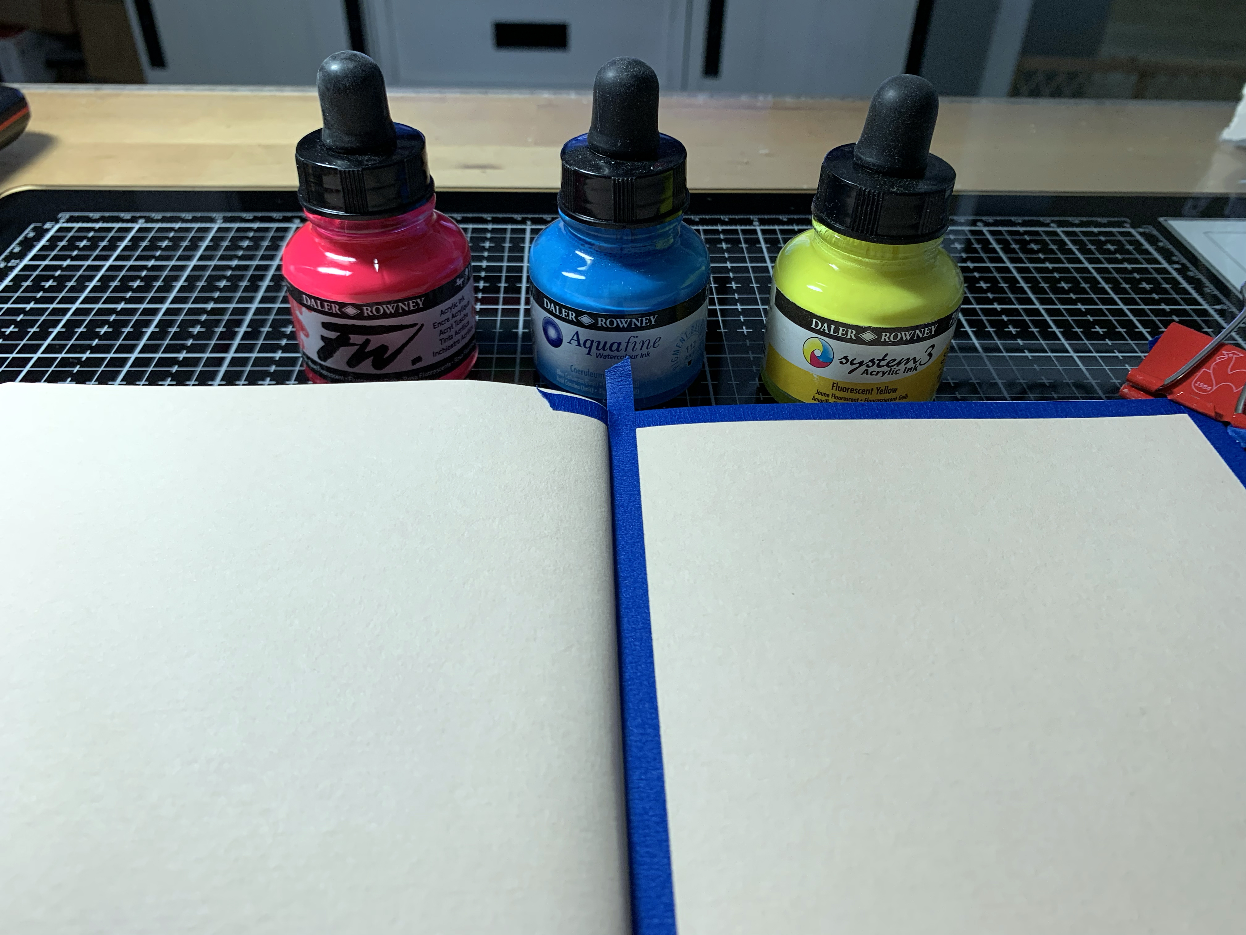
For my next page I pulled out three colors of Daler Rowney
acrylic inks. Not watercolors but inks, though they do work similarly.
I began by thoroughly wetting the page with water. Then I used the droppers inside the bottle tops and dropped bits of color around the page. You can see I had a lot of water on my paper!
Using a wet brush I was able to move the inks around and get complete color coverage on the page. See that orange stripe right down through the middle of the page? That is where I had too much water added to the ink. A tissue blotted up what didn't need to be there, then I let this dry. I had so much wet on the page but it didn't matter. This toned watercolor book can take it! Let me show you how I finished this page.
Once the page was totally dry, I used a
Tombow Mono Drawing Pen to add the four tangles - printemps, rock 'n roll diva dance, crescent moon and arukas. Shading was done with graphite and highlights were done with a Poscal paint pen. I use those Poscas in just about everything I do!
So watercolor and acrylic inks worked great.
For this piece I opted for no background. I just grabbed my
Sarasa DryX gel pen from Zebra Pen and started tangling. Honestly I wanted to try that Arukas pattern again but only adding the long lines on one side of the curve, not both, to see what would happen. I love how it turned out! A variation of Arukas! My Zebra pen and the graphite shading worked as great on this paper as I knew it would!
Lately I have been coloring a lot of digital images with
Copic markers. This time I actually stamped the image directly onto one of the beige pages, then added the Copic coloring. I didn't really get true color from the markers but I am okay with the colors I got. And strangely enough, the Copics which usually bleed through everything did not bleed through this 95 lb. paper.
This was a fun page to paint based on a piece of art Tracy Weinzapfel posted. I began with a layer of
pink gesso all over the page. Then I used three colors of acrylic paint to stroke up and down the page until I got a look I liked. Once the page was dry, I drew the hearts with a Sharpie ultra fine pen, then painted them with more acrylic. Final touches are . . . Posca paint pens and white acrylic splatters. I love this page! And let me tell you this page is totally flat! Hahaha!
But let me show you my absolute favorite thing to do right now! I used Ranger
distress ink pads and a
blending tool to cover the page with three colors. I didn't care that it wasn't perfect because I knew a lot of this color would be getting covered up by something really awesome!
My friend Kimberly McGuiness just released a new coloring book of really cool cats called Zen Whiskers! And I love cats! I reduced the size of this image, printed it out and colored it with my Copic markers. Isn't she gorgeous??? I also used a couple strips of acrylic/stenciled papers in the background, some Clean Color Dot Pens, a couple sentiments and a pink Posca. This watercolor book is even good for collage and art journaling!
I tried a number of techniques and used a variety of art supplies while trying out Hahnemühle's new Toned Watercolor Book. Everything I tried worked great. I find no short comings with this book. Even the shape of the pages are perfect for social media posts! You can be assured the art you do is just right for this book. I will leave you with a link where you can purchase your own copy - I hope you will show me how you use your Toned Watercolor Book! I know you are going to love it!
Hahnemühle's Beige Tone Watercolor Book can be found by clicking here.
Hahnemühle's Grey Tone Watercolor Book can be found by clicking here.


I love all your art works and the cat is so great👍👍👍
ReplyDeletethanks, you would love Kim's book. there are 30 cats similar to this one. I scanned and printed this one out much smaller than it was in the book
DeleteI saw it in your group. It's a wonderful coloring book with lots of details! Yes, I love it. Thank you for your tip. I do the same thing with coloring books as you dear Alice ❤️❤️❤️
DeleteHaving used both the beige-toned and grey-toned books, I can tell you they are amazing to work on. I absolutley love what you've done here!
ReplyDeleteThank you. The paper is lovely to work on.
DeleteThe way you move between mediums amazes me but & can see your hand especially in that last one with the cat; it's the layout & just the way you put things together with that distinctive edging. The paper certainly took a battering with what you put it through. The square size sounds ideal for tangling too. Lovely to see you getting stuck in to artwork again. - Evy
ReplyDeleteI'm trying really hard. the art doesn't come as easy as it once did. I still have trouble focusing. my cancer doctor told me last week it will probably never improve. that once you have gotten to a year past chemo - where you are is usually where you will be. but I will keep trying anyway.
DeleteSending a hug - Evy
Delete