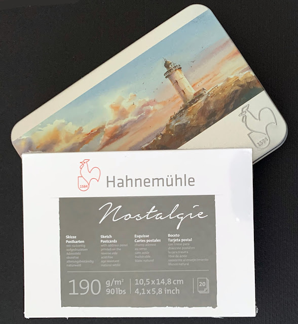
Did you know every year on October 1st we celebrate World Postcard Day? Yep! We do! It happens each year since 2019 when we celebrated the 150th anniversary of the postcard. Need to shoot off a message to Grandma but too tired to write a full blown letter? Maybe time is an issue? Perhaps you want to pen a short message to brighten someone's day? The postcard can be your go-to for birthdays, holidays, retirements, catching up or to just say "hello, I was thinking about you." And where do you start? Well, you really should start with Hahnemühle. I did. I grabbed a tin of their cold pressed watercolor postcards and a pad of their Nostalgie sketch postcards and got started.
Since the tin postcards are advertised as 'watercolor' I began by pulling out my set of
Schmincke watercolors and painted a nice wet on wet background. I love the bright colors you get with Schmincke and this paper loved the color. I was able to stick with just one layer of paint for this particular card.
Drawing was done with a Sharpie ultra fine point and this paper is heavy enough the Sharpie did not bleed through. Not even any ghosting on the back side. I also used Posca paint pens, Archival ink and a couple gelly roll pens. My product worked great on this 105 lb. card. Color me impressed.
My next experiment involved the Nostalgie sketch postcard and some
Dyestress Inks from ColorBox.
Looks like a hot mess but this technique works great! I used the three colors above and just swirled the pads all over my postcard.
To complete this card I used a Sarasa
Dry X20+ gel pen from
Zebra Pen and tangled up a stack of patterns. I also used a
Zig Clean Color Metallic Dot pen and a
Posca paint pen to accent. The Nostalgie postcards are a little lighter at 90 lbs. and the cards did great with no ghosting or bleed through at all. Very pleased with both types of postcard.
While I was working with distress type inks, I brought out three colors of Tim Holtz'
Distress Inks and a
fun stencil from Art By Marlene. After applying color through the stencil I added all the penwork you see. I used: Sharpie ultra-fine tip, ink blending tool, Distress Ink, Posca Paint Pen and Archival ink. They all worked great.
Lately I have been doing a lot of cutting and glueing, mixing it with my tangled designs and whatever I have on my desk at the time. This background is another of Tim's distress inks scrubbed on all over. The little frogman was drawn by artist Chris Ryniak; I colored him with Copic markers. On this postcard I also used: a
stencil, Posca paint pens, Archival ink, word art from Art By Marlene and a blending tool. I will just go ahead and say it here, then not repeat it, none of the products I used bled through to the back. And there was no ghosting on any of the cards. No warping and no pilling either.
I think this is my favorite of all the Nostalgie cards I made - Schmincke watercolor paints used in a wet on wet technique. Basically I flooded the postcard with water then started dropping the paints into all that lovely wet space. Then I left it sitting to dry. Isn't it beautiful? I don't think I will be drawing anything on the piece. I love it just like this!
Next I painted watered down Schmincke watercolors onto a dry postcard. This is called wet on dry. I pushed the color with just the wetness on the brush. Some colors blended, some stayed pretty much where I put them. This card is not my favorite and it will get more art added to it in time.
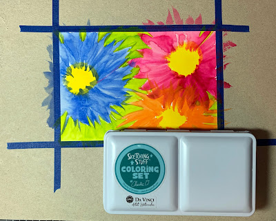
This next postcard started with loose painted lines for flowers - using DaVinci's Sketching Stuff Coloring Set by Charlie O'Shields. He loves bright colors as much as I do! For my flower lines I just went free hand with streaked outward lines.
I completed my flowers with a Sharpie ultra-fine pen and Posca paint pens. I love the way this turned out!
For my last card I went back to the tin of cold pressed watercolor postcards and made my favorite card! I won't be mailing this one to anywhere, it is staying right here with me! Hahahaha!
This background was fun. Schmincke watercolors started it, then I used a
stencil and some Distress Ink to make water-like designs all over the card. A fan brush and some
black acrylic ink from Daler Rowney made some awesome splatters. The floating girl is a design by
Krista Leigh Smith - I colored her with Copic markers and some
Ohuhu glitter pens. The words are from
Dylusions' Dyan Reaveley. Colored those with Copics, too. The edges are inked with Archival black. I just love the whole vibe of this piece of art!
So. To summarize. Go get you some of either of these postcard sets. Or both. Hahaha! They do give different results. The tin has the texture of cold pressed paper whereas the Nostalgie cards are smooth with no texture. I know it matters to some of you - texture or no texture. I can work with either one and I did! And nothing went wrong, every supply I tried worked awesomely well! I love them all! (Did I already say that? Hahahaha!) So what to do now? I think I will go work on a few more postcards. I would love to see what you do with yours! Have a great day!
You can purchase a tin of Hahnemühle watercolor postcards by
clicking here.
You can purchase a pad of Hahnemühle Nostalgie postcards by
clicking here.


Fantastic information on the way you did these beautiful cards and they are beautiful
ReplyDeletethank you, I love working in this size and the postcards are perfect for it
DeleteThese are such amazing postcards! Whoever gets one is going to be very happy to receive it! I use the Hahnemühle postcards constantly and the Nostalgie paper is my favorite non-watercolor paper. In your hands, you really make it sing!
ReplyDeleteThank you so much 🤗❤️ these are both great papers to work with
Deleteyours looks amazing
ReplyDeleteThank you so much ❤️
DeleteThe first one & the one with the blue, pink & orange flowers on the lime green background using Charlie's Sketching Set are my favourites. The way you achieve those flowing lines in the flowers with the contrasting black & white linework in different line weights. - Evy
ReplyDeletethanks, Evy. I love Charlie's set - the colors are exactly what I like - bright and beautiful!
Delete